When it comes to home design, small details often make the biggest difference. Banisters, often overlooked, have the power to completely transform a staircase or hallway. Painting your banister in a thoughtful and creative color scheme can elevate the aesthetic of your entire home. Whether you are drawn to modern minimalism, rustic charm, or bold artistic expression, the right banister color can serve as both a statement piece and a seamless design complement.
In this post, we will explore ten unique color scheme ideas for painting banisters that will inspire your next home update. Each idea blends style, mood, and practical tips to help you achieve a professional, Pinterest-worthy finish.
1. Classic Black and White Contrast
A timeless choice that never goes out of style, black and white is the ultimate combination for a sleek and sophisticated look. Painting your banister rail black while keeping the spindles or balusters white creates a sharp contrast that draws the eye and complements any interior style.
This color scheme works especially well in homes with neutral or monochromatic palettes. It enhances the architectural lines of the staircase and makes it appear both modern and elegant. Matte black finishes add depth and drama, while a high-gloss black provides a polished, formal touch.
Tip: To maintain the clean look, make sure your white paint has a slight satin or semi-gloss finish to resist dirt and fingerprints.

2. Warm Wood and Soft Cream
For homeowners who love a cozy, organic aesthetic, pairing natural wood tones with soft cream is a beautiful option. This color scheme balances the warmth of wood with the calm of a neutral hue. You can stain the handrail in a rich walnut or honey tone and paint the spindles in cream or off-white.
This look fits perfectly in farmhouse, rustic, or transitional interiors. It gives the staircase a sense of timeless comfort and highlights the natural grain of the wood.
Tip: Choose a cream shade with a slight yellow or beige undertone to harmonize with the wood’s warmth.

3. Deep Navy and Crisp White
If you want something classic but with more personality than black and white, navy and white is a perfect pairing. The navy adds sophistication and color depth without being too bold, while white keeps the design airy and balanced.
This color scheme looks particularly beautiful in coastal or modern homes. The deep navy creates visual grounding, especially if you pair it with light-colored walls or flooring.
Tip: Use a semi-gloss navy for durability and easy cleaning, particularly on high-touch areas like the handrail.

4. Muted Sage and Natural Oak
Muted green shades are trending in home design, offering a calm, nature-inspired vibe. A sage-green banister paired with natural oak steps or rail details creates a refreshing and grounded look. The combination feels organic and modern at the same time.
This palette suits Scandinavian-inspired interiors or homes with abundant natural light. Sage green’s soft tone complements earthy materials like jute rugs, linen drapes, and light woods.
Tip: If your space is small, opt for a lighter sage to prevent the banister from feeling too heavy.

5. Charcoal Gray and Warm White
For a modern yet inviting aesthetic, charcoal gray combined with warm white offers the perfect balance. The dark gray adds depth and sophistication without the starkness of black. When paired with creamy white spindles or trim, it gives a soft, refined look.
This scheme works well in contemporary homes, particularly those with metal or glass accents. It also enhances staircases with modern lighting fixtures or minimalist décor.
Tip: Add a touch of metallic hardware or a warm wood floor to bring contrast and texture to the space.

6. Earthy Terracotta and Soft Beige
Terracotta tones are making a big comeback, bringing warmth and Mediterranean charm into interiors. Painting your banister in an earthy terracotta shade with beige or cream accents can make your staircase a focal point full of personality.
This color scheme works beautifully with bohemian, rustic, or eclectic interiors. The earthy tones blend naturally with woven materials, clay accents, and wooden furniture.
Tip: Choose a matte or eggshell finish for terracotta to keep the texture soft and natural-looking.

7. Forest Green and Gold Accents
For a luxurious yet grounded design, forest green paired with gold or brass details creates a stunning impact. Painting the handrail or newel posts in a deep forest green immediately brings richness and sophistication to your staircase. Adding gold brackets or finials enhances the elegance.
This look fits beautifully in heritage homes, traditional interiors, or even bold modern spaces. Forest green adds depth and personality while remaining timeless.
Tip: If gold feels too bold, use antique brass for a subtler touch. It complements dark green beautifully.

8. Soft Gray and Pastel Blue
If you love a calming, airy environment, combining soft gray with pastel blue creates a dreamy, soothing effect. This gentle palette works wonderfully in homes that favor coastal, Scandinavian, or modern farmhouse styles.
Painting the spindles light gray and the handrail pastel blue gives the staircase a delicate two-tone look. It also pairs well with white walls and light flooring for an open, tranquil atmosphere.
Tip: Choose a cool gray with blue undertones to maintain harmony between the shades.

9. Bold Black and Natural Wood
For a modern-industrial look, a combination of matte black and natural wood is unbeatable. The black adds structure and boldness, while the wood introduces warmth and texture.
This scheme suits loft-style interiors, modern rustic homes, or minimalist designs. You can paint the spindles black while keeping the handrail or treads in natural oak or walnut. The result is both sleek and welcoming.
Tip: Use a matte or satin finish black for a more contemporary appearance, and seal the wood with a clear satin varnish for contrast.

10. Monochrome Gradient
For a unique, creative touch, try a monochrome gradient effect on your banister. This means using multiple shades of the same color, from light to dark, along the spindles or across different levels of the staircase.
For instance, you could start with pale gray at the base and transition to deep charcoal at the top. This adds visual intrigue and depth without overwhelming the space.
This artistic approach works best in modern or eclectic homes, offering a one-of-a-kind focal point that feels like a design feature rather than just a functional element.
Tip: Use sample pots to experiment with gradients before committing to the full staircase. Keep the tones within the same family for cohesion.

Choosing the Right Paint Finish
Selecting the right paint finish is just as important as choosing the color. For banisters, durability and ease of cleaning are crucial since they are high-touch surfaces.
- Gloss or Semi-Gloss: Ideal for handrails, as they resist scuffs and are easy to wipe clean.
- Satin: Offers a soft sheen without being too shiny, suitable for spindles and posts.
- Matte or Eggshell: Best for decorative banisters in low-traffic areas, where a velvety finish adds sophistication.
Coordinating Banisters with Overall Décor
When planning your banister color, think about how it fits into the rest of your home. The goal is to create visual harmony rather than a clash of tones. Here are some coordination ideas:
- Neutral Homes: Add a pop of color through your banister for interest. For example, deep navy or forest green can add subtle drama.
- Colorful Spaces: Keep banisters neutral (white, black, or gray) to balance the energy.
- Wood-Rich Interiors: Combine painted accents with stained wood for a layered, natural look.
- Modern Minimalist Homes: Stick to a limited color palette like black, white, and gray for a sleek, uncluttered look.
Painting Tips for a Professional Finish
A perfectly painted banister enhances your home’s look and feels professionally done when attention is given to preparation and technique.
- Prep the Surface: Clean thoroughly to remove dust, oils, and old finish. Sand lightly to smooth the surface.
- Prime Properly: Apply a primer suitable for your chosen paint type. It helps with adhesion and even coverage.
- Use Quality Brushes: For detailed spindles, use angled brushes or small foam rollers for a smooth finish.
- Work in Sections: Paint small sections at a time to prevent drips and ensure even coats.
- Apply Multiple Thin Coats: Two or three thin coats provide better results than one thick coat.
- Seal for Protection: Consider a topcoat for high-traffic areas to protect against wear and fingerprints.
Why Painted Banisters Matter in Interior Design
A well-painted banister adds character and connects your home’s design elements. Staircases often sit at the heart of a house, acting as a visual link between different levels. A thoughtfully chosen banister color can:
- Define the aesthetic style (modern, classic, rustic, etc.)
- Add visual contrast and balance to neutral interiors
- Reflect personality through subtle or bold choices
- Tie together existing design elements such as wall color, flooring, or furniture
Even a small color change can make the staircase feel fresh and cohesive with the rest of your décor.
Experimenting with Creative Color Techniques
If you want to go beyond traditional paint styles, experiment with creative finishes that make your staircase truly stand out.
- Ombre Effect: Blend two or more shades of the same color for a gradual transition.
- Two-Tone Contrast: Paint the handrail and spindles in different but complementary colors.
- Distressed Look: Use sandpaper on painted wood to reveal hints of the natural grain beneath for a vintage effect.
- Metallic Touch: Add subtle metallic highlights like gold, bronze, or silver to bring a luxurious glow.
These techniques add individuality and elevate the staircase from functional to decorative.
How Lighting Affects Banister Colors
Lighting plays a crucial role in how colors appear. Natural daylight will show paint colors in their truest form, while artificial light can warm or cool their tones.
- Warm Lighting: Makes whites appear creamier and grays more beige.
- Cool Lighting: Enhances blue, green, and gray tones for a crisp look.
- Mixed Lighting: Offers balance but requires careful testing to ensure the color looks appealing in all conditions.
Always test paint samples under your home’s lighting before making a final decision.
Bringing It All Together
Your staircase is more than a means to move between floors—it is a visual feature that connects your home’s design story. Painting your banister with a unique and thoughtful color scheme can dramatically change the atmosphere, making your space feel refreshed and refined.
Whether you lean toward timeless classics like black and white, organic tones like sage and oak, or bold statements like forest green and gold, there is a color scheme to match every personality and interior style.
Take your time exploring combinations, test samples under your lighting, and enjoy the transformation that comes with creativity and craftsmanship.
A beautifully painted banister can instantly turn your staircase into a captivating design statement—proof that the smallest details often make the biggest impact.
Author

admin@weltpromi.de
Related Posts
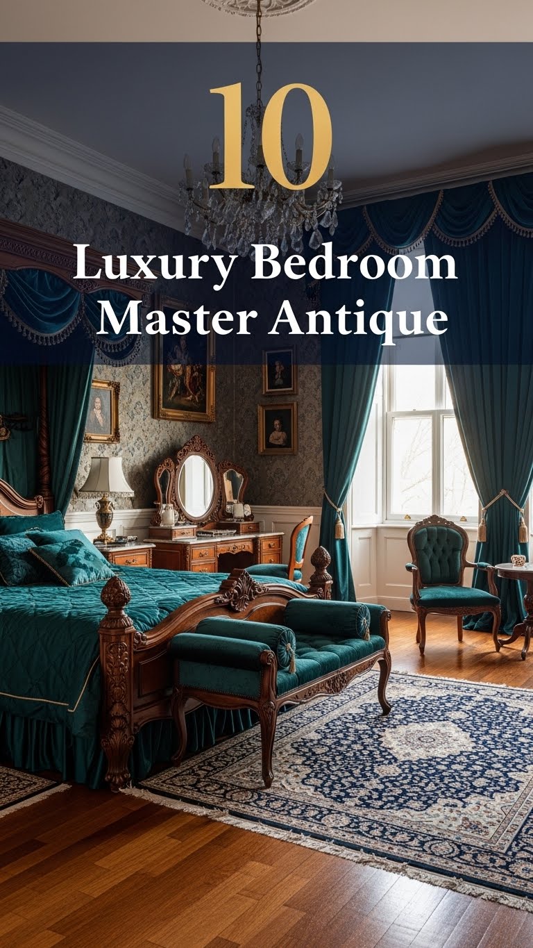
10 Luxury Bedroom Master Antique
Creating a luxurious master bedroom is all about blending comfort, elegance, and timeless design. When you add antique elements into the mix,...
Read out all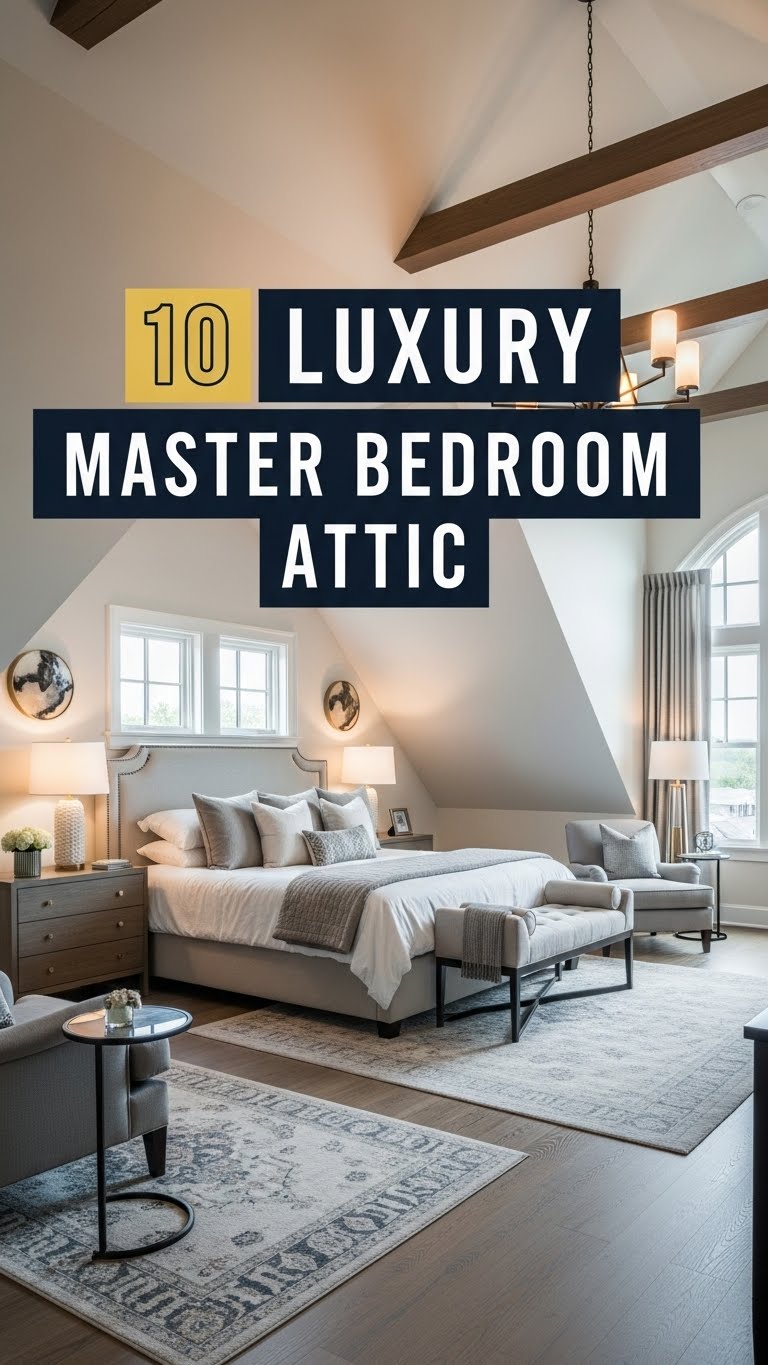
10 Luxury Master Bedroom Attic
Turning an attic into a luxurious master bedroom is an excellent way to maximize your home’s potential. Attics often come with unique...
Read out all
10 Luxury Bedroom Master Aesthetic
Creating a luxurious master bedroom is about more than just choosing expensive furniture. It is about crafting a space that embodies comfort,...
Read out all
10 Bedroom Bed Designs
Your bedroom is more than just a place to sleep—it’s a sanctuary, a personal retreat where style and comfort meet. Central to...
Read out all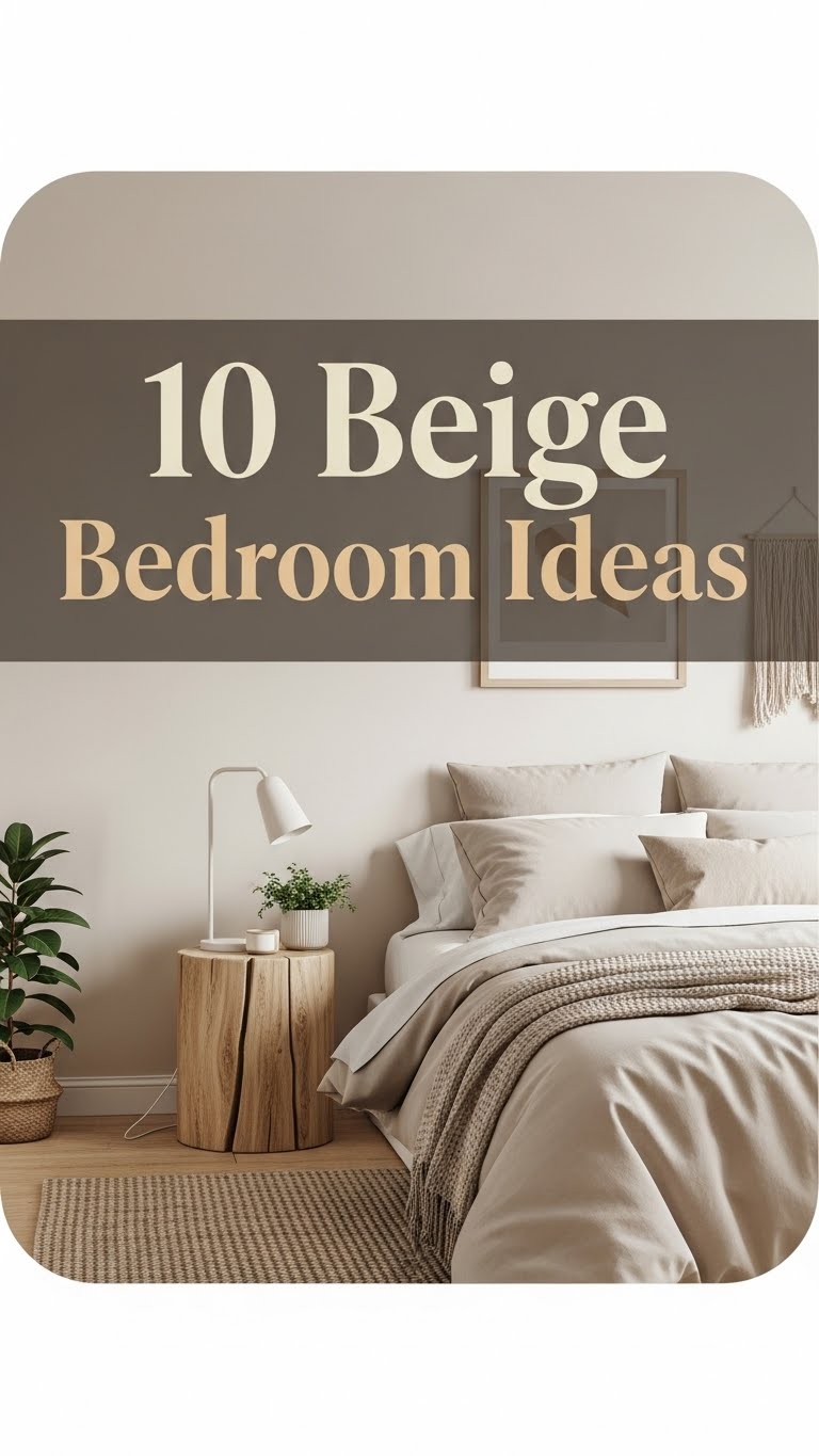
10 Beige Bedroom Ideas
When it comes to bedroom design, beige is a timeless and versatile color that exudes warmth, sophistication, and calm. Unlike brighter colors...
Read out all
10 Cool Bedroom Ideas
Your bedroom is more than just a place to sleep. It is your sanctuary, your personal retreat, and a reflection of your...
Read out all