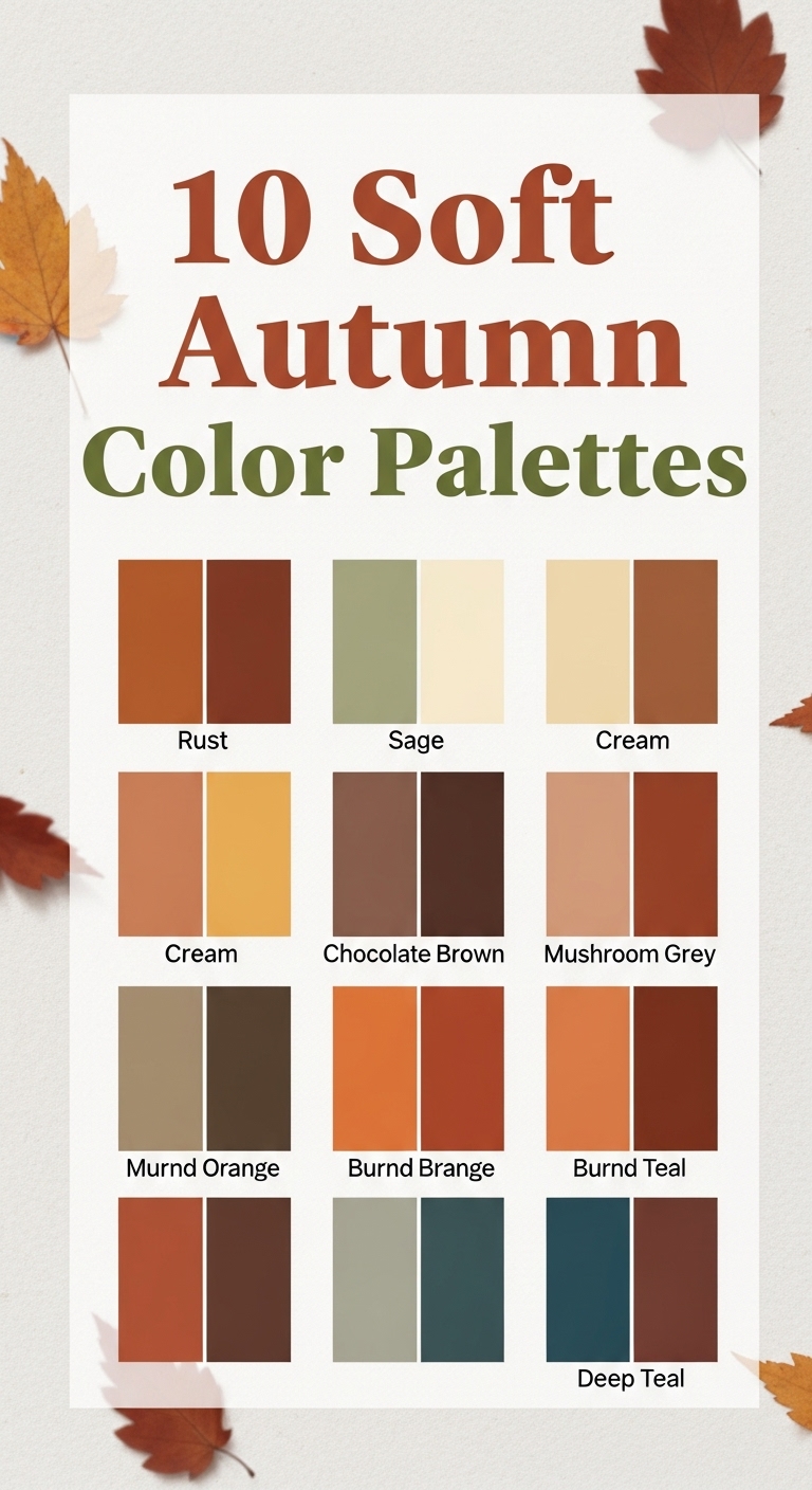
Autumn is a season of subtle beauty, where the landscape transforms into a warm, gentle symphony of colors. Soft autumn color palettes capture the essence of this season, offering muted, warm, and earthy tones that are perfect for interiors, fashion, and creative projects. Unlike bold autumn shades that scream with intensity, soft autumn hues are understated, sophisticated, and versatile. In this guide, we will explore ten soft autumn color palettes and how you can incorporate them into your home, wardrobe, and lifestyle.

What Defines a Soft Autumn Palette?
Before diving into the palettes, it’s important to understand what makes a color palette “soft autumn.” These colors are:
- Muted and warm: Soft autumn colors have a gentle, subdued quality. They are not bright or high contrast but have a cozy warmth.
- Earth-inspired: Think of fallen leaves, dry grasses, soft woods, and hazy sunsets.
- Balanced: These colors often include a mix of neutrals, accent colors, and muted tones that harmonize effortlessly.
Soft autumn palettes are ideal for anyone who wants a natural, calm, and approachable aesthetic. They can be used in home décor, fashion styling, weddings, graphic design, and seasonal crafts.
1. Warm Taupe and Cream
A classic soft autumn combination, warm taupe paired with cream creates a soothing and inviting base. Taupe is versatile, providing a neutral backdrop, while cream adds lightness and softness.
Applications:
- Home décor: Use taupe walls with cream accents in furniture and throw pillows.
- Fashion: Taupe coats with cream sweaters or scarves create effortless elegance.
- Accessories: Wooden frames and cream ceramics complement this palette beautifully.
This palette embodies understated elegance, perfect for creating a calming environment or a soft autumn outfit.

2. Muted Terracotta and Sage
Terracotta brings in the warmth of fall leaves, while sage introduces a soft green contrast. This combination is grounded, natural, and incredibly harmonious.
Applications:
- Home décor: Terracotta vases paired with sage cushions or curtains.
- Wardrobe: Terracotta skirts with sage tops or accessories.
- Floral arrangements: Dried flowers in muted oranges with sage foliage enhance seasonal décor.
The muted quality ensures this palette feels organic and not overly vibrant, ideal for anyone looking for subtle autumn tones.

3. Soft Mustard and Dusty Olive
Soft mustard introduces a touch of golden warmth, while dusty olive adds depth and sophistication. This combination captures the essence of autumn fields and forests.
Applications:
- Home décor: Olive walls with mustard accents in rugs, throws, or art pieces.
- Fashion: Mustard cardigans with olive pants or skirts provide a chic seasonal look.
- Wedding décor: Centerpieces with muted yellows and olive greenery create a warm ambiance.
This palette balances warmth and coolness, perfect for versatile styling and layering.

4. Blush Peach and Warm Gray
Blush peach brings a gentle, romantic warmth, while warm gray acts as a grounding neutral. This palette feels soft, airy, and modern.
Applications:
- Home décor: Blush peach cushions on gray sofas create a cozy yet stylish look.
- Fashion: Peach blouses with gray trousers or skirts make for soft autumn office wear.
- Stationery: Wedding invitations or seasonal cards can use blush peach with gray typography.
This palette is especially ideal for spaces or outfits that need a subtle touch of warmth without overwhelming the senses.

5. Cocoa Brown and Soft Caramel
Rich cocoa brown paired with soft caramel evokes the feeling of warm autumn afternoons. These deep, muted tones are perfect for creating a cozy atmosphere.
Applications:
- Home décor: Cocoa brown sofas with caramel throws and cushions.
- Fashion: Brown boots and belts combined with caramel coats or sweaters.
- Kitchen décor: Wooden utensils and caramel-colored ceramics complement this earthy palette.
This palette exudes comfort and richness without being heavy or dark.
6. Dusty Rose and Sage Green
Dusty rose is a muted pink with a warm undertone, while sage green introduces a cool but soft contrast. Together, they create a sophisticated and natural palette.
Applications:
- Home décor: Sage walls with dusty rose accents in textiles or artwork.
- Fashion: Dusty rose dresses with sage accessories or jackets.
- Floral décor: Roses and greenery in muted shades evoke a soft autumn feeling.
This combination is timeless, romantic, and versatile across multiple design contexts.

7. Soft Pumpkin and Creamy Beige
Soft pumpkin brings a subtle pop of orange, paired with creamy beige to balance the warmth. This palette is playful yet understated.
Applications:
- Home décor: Pumpkin-colored accent chairs or rugs on beige floors or walls.
- Fashion: Beige trousers with pumpkin sweaters for seasonal layering.
- Crafts: Fall wreaths or table décor in these shades enhance seasonal charm.
The muted orange ensures this palette is cozy without feeling too loud or seasonal-specific.

8. Olive Green and Mocha
Olive green provides a grounded, earthy base, while mocha adds warmth and depth. This combination is sophisticated and versatile.
Applications:
- Home décor: Olive green cabinetry or accent walls with mocha furniture.
- Fashion: Olive jackets or pants with mocha boots and bags.
- Outdoor décor: Planters or garden furniture in these tones create harmony with nature.
This palette works beautifully in both minimalist and traditional settings, providing a connection to the natural world.

9. Muted Coral and Sand
Muted coral brings subtle vibrancy, while sand tones provide a soft, neutral base. This palette is warm, inviting, and light-hearted.
Applications:
- Home décor: Coral cushions or vases on sand-colored furniture or rugs.
- Fashion: Coral tops or scarves paired with sand pants or skirts.
- Seasonal décor: Candles, pottery, or art pieces in these colors brighten autumn spaces.
This palette is perfect for those who want gentle warmth without going overboard on color.

10. Warm Almond and Sage Gray
Warm almond tones paired with sage gray create a refined, balanced palette. Almond brings warmth, while sage gray adds softness and serenity.
Applications:
- Home décor: Almond walls with sage gray furniture for a serene living space.
- Fashion: Almond coats with gray scarves or sweaters for a polished look.
- Accessories: Rugs, throws, or pillows in these shades complement many interiors.
This palette is elegant, understated, and incredibly versatile for both modern and traditional designs.

How to Use Soft Autumn Palettes in Your Life
In Home Décor
- Layering colors: Start with a neutral base and layer in muted accent colors through furniture, textiles, or décor.
- Textures: Combine soft fabrics like linen, wool, and cotton with muted wooden finishes for a cozy, autumnal vibe.
- Seasonal touches: Incorporate seasonal elements like dried flowers, pumpkins, or candles in your chosen palette for extra warmth.
In Fashion
- Mix and match: Pair muted tones together for a harmonious look. Avoid overly bright colors that clash with soft autumn hues.
- Layering: Soft autumn colors are ideal for layering – think cardigans, scarves, and coats.
- Accessories: Shoes, bags, and jewelry in complementary muted tones can elevate your outfit effortlessly.
In Creative Projects
- Graphic design: Soft autumn palettes can make websites, social media graphics, and print materials feel calm and approachable.
- Stationery: Invitations, greeting cards, and notebooks in soft autumn tones are visually appealing and timeless.
- Photography: These muted tones create natural, warm, and inviting photographs for both lifestyle and product shoots.
Tips for Choosing Your Soft Autumn Palette
- Consider your lighting: Soft colors look different under natural and artificial light. Choose palettes that complement your environment.
- Balance warm and cool tones: Even muted colors can feel off-balance if not mixed thoughtfully. Pair warm tones with soft neutrals or muted cool tones.
- Think about versatility: Choose palettes that can transition from season to season and from fashion to home décor.
- Personal preference: Ultimately, pick shades that resonate with your style and mood. Soft autumn colors are meant to create comfort and harmony.
Conclusion
Soft autumn color palettes offer a perfect blend of warmth, muted beauty, and timeless elegance. Whether you are redecorating your home, refreshing your wardrobe, or working on creative projects, these ten palettes provide endless inspiration. From warm taupes and creamy neutrals to muted terracotta and dusty rose, the possibilities are endless. The key is to embrace the subtlety, create balance, and enjoy the cozy, inviting atmosphere that soft autumn colors bring to your life.
By incorporating these palettes thoughtfully, you can transform your spaces and style into a serene autumn-inspired haven. Whether you choose one palette or mix elements from several, soft autumn colors are a celebration of understated beauty, harmony, and natural warmth.
Author
admin@weltpromi.de
Related Posts
10 Luxury Bedroom Master Antique
Creating a luxurious master bedroom is all about blending comfort, elegance, and timeless design. When you add antique elements into the mix,...
Read out all
10 Luxury Master Bedroom Attic
Turning an attic into a luxurious master bedroom is an excellent way to maximize your home’s potential. Attics often come with unique...
Read out all
10 Luxury Bedroom Master Aesthetic
Creating a luxurious master bedroom is about more than just choosing expensive furniture. It is about crafting a space that embodies comfort,...
Read out all
10 Bedroom Bed Designs
Your bedroom is more than just a place to sleep—it’s a sanctuary, a personal retreat where style and comfort meet. Central to...
Read out all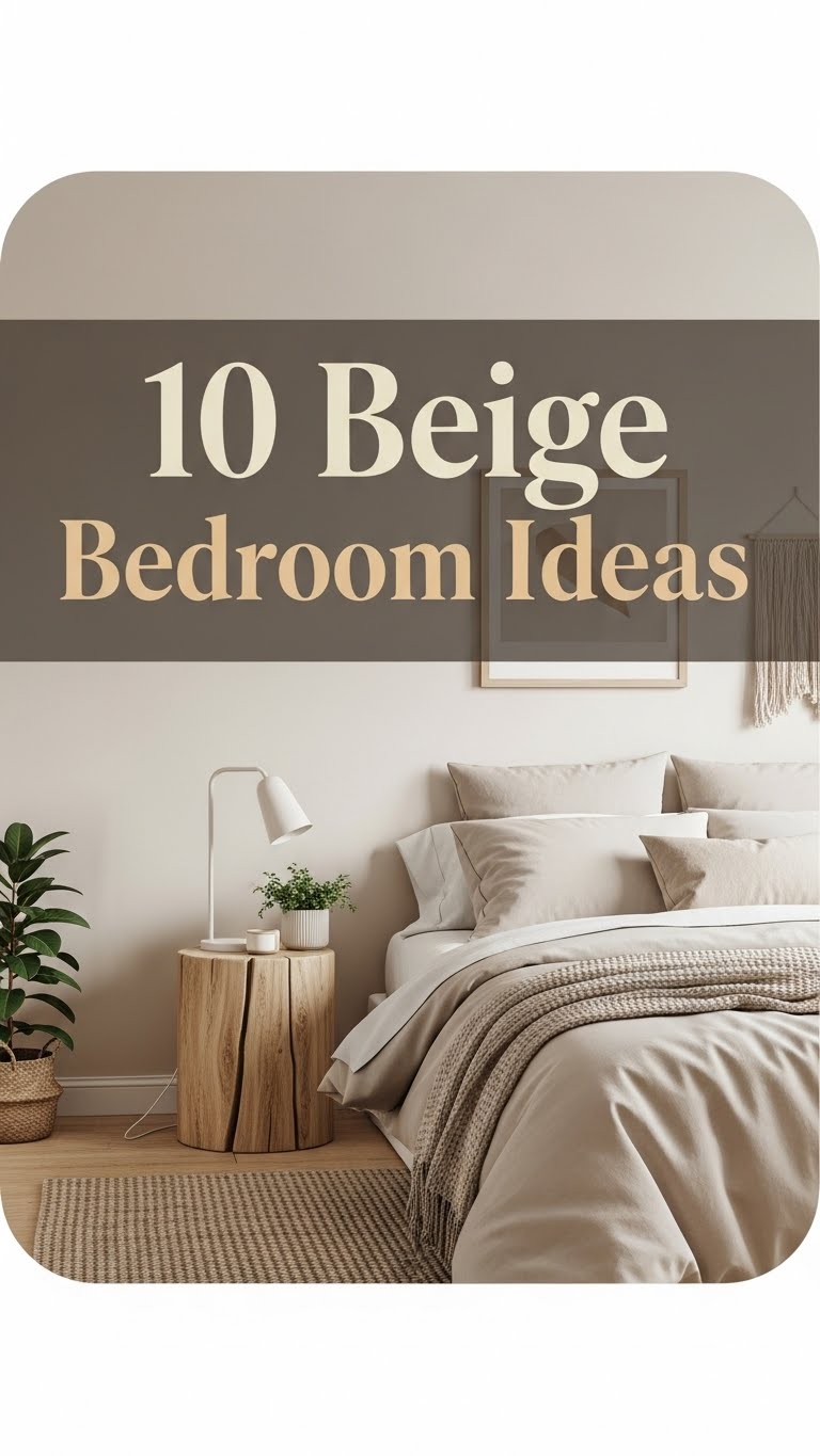
10 Beige Bedroom Ideas
When it comes to bedroom design, beige is a timeless and versatile color that exudes warmth, sophistication, and calm. Unlike brighter colors...
Read out all
10 Cool Bedroom Ideas
Your bedroom is more than just a place to sleep. It is your sanctuary, your personal retreat, and a reflection of your...
Read out all